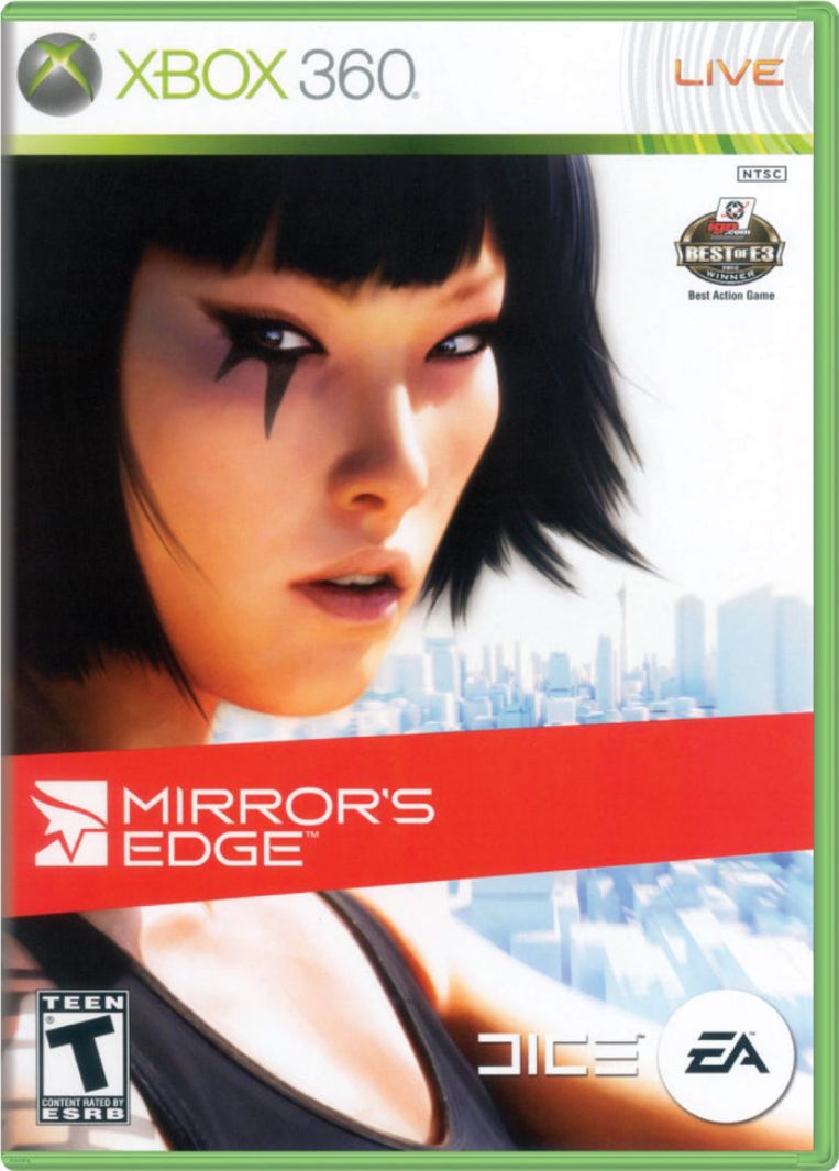
Video Games » Review - Mirror's Edge - Xbox 360
written by owen, published 2025-Mar-13, comment
The art style is pretty but bad level design choices made the game more annoying than it needs to be. In some cases the level designers force the player to change direction when the nature of game encourages a forward flow state. With video games you are free to create near any structure you desire. Why not create a structure that is fun?
Its not fun
Sometimes the direction you should go is not clear, so much so that they give you a button point you in the correct direction. This shouldn't be needed. There are red highlights that appear but then they made a red level which made everything blend together and I was like lol, omg, why? The game is more a case of confusion as they add in pointless things like trains, armed guards and helicopters. It's a case where the designers want to maintain tension but there is no way to avoid the these sections. So you are forced into a sort of mania.
I should have known from the 2008 release date on the home screen that I was about to enter a world of jank. I mistakenly adjusted the video settings to very dark because most of the game is bright and over exposed. But unbeknownst to me, a couple levels deep into the game the designers put me in an air vent which was pitch black because of my settings. Why have air vents at all when you can render almost any structure?
Another problem I find with this game is some of the spaces make no sense physically. I understand that they want to force you down a certain path but some high rise floors have no down stairs or rooms with no exits. Sometimes you end up in a space which just simply does not add up. Only to eventually see a open vent above you. It messes with your mental map of spaces.
Lets not talk about the janky combat and the helicopters that are permanently on your tail. [h]Please leave me a lone let me navigate the spaces in peace.[h] After playing Hitman Absolution (2012) with its miriad of options and paths in this game I got total clusterphobia.
It is obvious when the game is forcing you down a tunnel when easier - more natural paths - could have been allowed at extra cost. There are even cases where you could simply run around an obstacle or use a wall jump but the designers purposely wall you in. The funny thing is once you do the thing that they set up you end up on the other side with no real benefit - only a sigh of relief that you overcame another annoying roadblock in your path. There is no cost to just allowing me to take the easier path.
I will try to complete the game just to see the environments but I am tempted to stop playing the game. [never completed it, maybe later, doubtful]
Conclusion
The game is pretty but the play is not polished. They tried too many things instead of just sticking to one core move set. It is hard for me to give this game anything more than a 5/10. 2008 jank. It does not maintain its flow and every puzzle has only one solution. I stopped playing in chapter 7 - the boat. I felt the game was wasting my time. After every puzzle instead of feeling accomplished I felt relief. My brain instantly erased the trauma of the previous hurdle. Dumb unrealistic rooms that exist only to setup a particular puzzle really grinds my gears.
Addendum
Also the game is very empty and its definitely a technical limitation(baked lighting) but it goes to places where people should be - instead of avoiding those places. If I was the producer I would have avoided any areas where the player would miss the absence of people. The dystopian city scape really doesnt explain away the lack of people. The story conflicts with the visuals as if it were 2 separate teams with no director. The game might have been better with no story at all. Or as a story with no game.