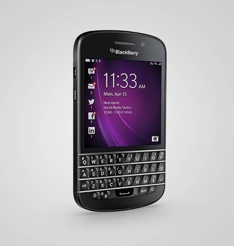
BlackBerry OS10 Review
Page is part of Technology in which you can submit a post
written by owen on 2014-Jun-09.

After using the Q10 for the past 3 weeks I can safely say that this is the best cellphone operating system that I have ever used. Once you get accustomed to swiping up and not having a answer call and hang up hard key.
Recommendations
On the Q10 remove the phone app from the bottom left edge of the screen or allow the user to customize the icon. Â Â Also the quick dial numbers are too close to the edge of the screen. It is very easy to accidentally call phone numbers while putting the phone into you pocket. Gripping the phone at the edges or when the phone app is open often results in the last number being dialed. Suggest having an option for confirmation before dialing a number.
BlackBerry hub
No filter for draft emails(fixed in 10.2 with pinch). I ended up having to prefix all my draft emails with "draft" so that I could use the subject search to find them. Â
File manager
When selecting photo files the sort order always resets to sort by name descending. It should remember the last sorting selection. Also the facebook app doesn't allow me to select a png file for my profile picture but the UI doesn't show that I am looking at a filtered list so I spend 10 minutes wondering why I can't see the png file I just recently saved in my folder.
Offer an option to create folders based on the day the photo was taken (instead of having a month long list) .
Facebook app
Can't write on a person's wall directly from the hub on thier birthday. Â This was a feature is the old BlackBerry os.
‎
‎Quick settings
There should be a quick setting for mobile data on/off. Sometimes I might be using wifi for an extended period and the wifi access might drop unexpectedly and the phone will start using the mobile data. Not good.
Music player
I don't see the need to spend the whole time looking at the cover art. Especially when you are playing and entire album. Show the list of songs or give an option to keep the album art minimized.‎ So far this is the most inefficient interface.
permanent link. Find similar posts in Technology.
comments
Comment list is empty. You should totally be the first to Add comment.